Welkom Kind

A refreshed and sharp brand identity and digital design for a childcare organization where laughing and learning together come first, helping to support children's development and provide a stable foundation.


Client

Welkom Kind

Expertises

Branding / UX / UI design

Duration

3 weeks

Collab

Jake Posthouwer

Welkom Kind

A refreshed and sharp brand identity and digital design for a childcare organization where laughing and learning together come first, helping to support children's development and provide a stable foundation.


Client

Welkom Kind

Expertises

Branding / UX / UI design

Duration

3 weeks

Collab

Jake Posthouwer

A strong foundation for development translated
into a brand identity

Welkom Kind is a childcare organization where the development of the child comes first. Through a personal conversation, a host parent is matched based on the parents' wishes, allowing them to go to work without having to worry about their child.


Problem

The problem was an outdated website that was no longer representative of the organization. Additionally, the branding was old and in need of a refresh to better position themselves in
the market and stand out from other childcare providers.

Solution

The solution was a new approach to refining the existing branding. Welkom Kind provides a strong foundation alongside home, where laughing and learning come first. This mission and vision were translated into the existing branding, expanding and refining it to make it fresh and modern again.

This updated branding was then carried through into a new digital design, creating hierarchy
between parents and host parents.

The process began with gaining insight
into what Welkom Kind stands for

The process began with gaining insight into what Welkom Kind stands for

By reviewing their current website, images, and having conversations, it quickly became clear that Welkom Kind values the development of the child greatly, but this must happen in a fun way.

This inspired me to translate their mission and vision of creating and providing a strong foundation through play into the familiar building blocks. Playing with basic shapes by fitting them into the right forms might seem like a fun activity, but it teaches the child a great deal. This idea formed the foundation of the new brand identity.

The cheerful yet soft colors and the simple, clean font translate Welkom Kind's playful mission and vision. This simplicity allows the basic shapes to stand out and lets the content speak for itself. It also enhances the gentle and caring nature of Welkom Kind.

The cheerful yet soft colors and the simple, clean font translate Welkom Kind's playful mission and vision. This simplicity allows the basic shapes to stand out and lets the content speak for itself. It also enhances the gentle and caring nature of Welkom Kind.

The cheerful yet soft colors and the simple, clean font translate Welkom Kind's playful mission and vision. This simplicity allows the basic shapes to stand out and lets the content speak for itself. It also enhances the gentle and caring nature of Welkom Kind.

The old shape sorting toy serves as
an inspiration for the brand identity

The old shape sorting toy serves as an inspiration for the brand identity

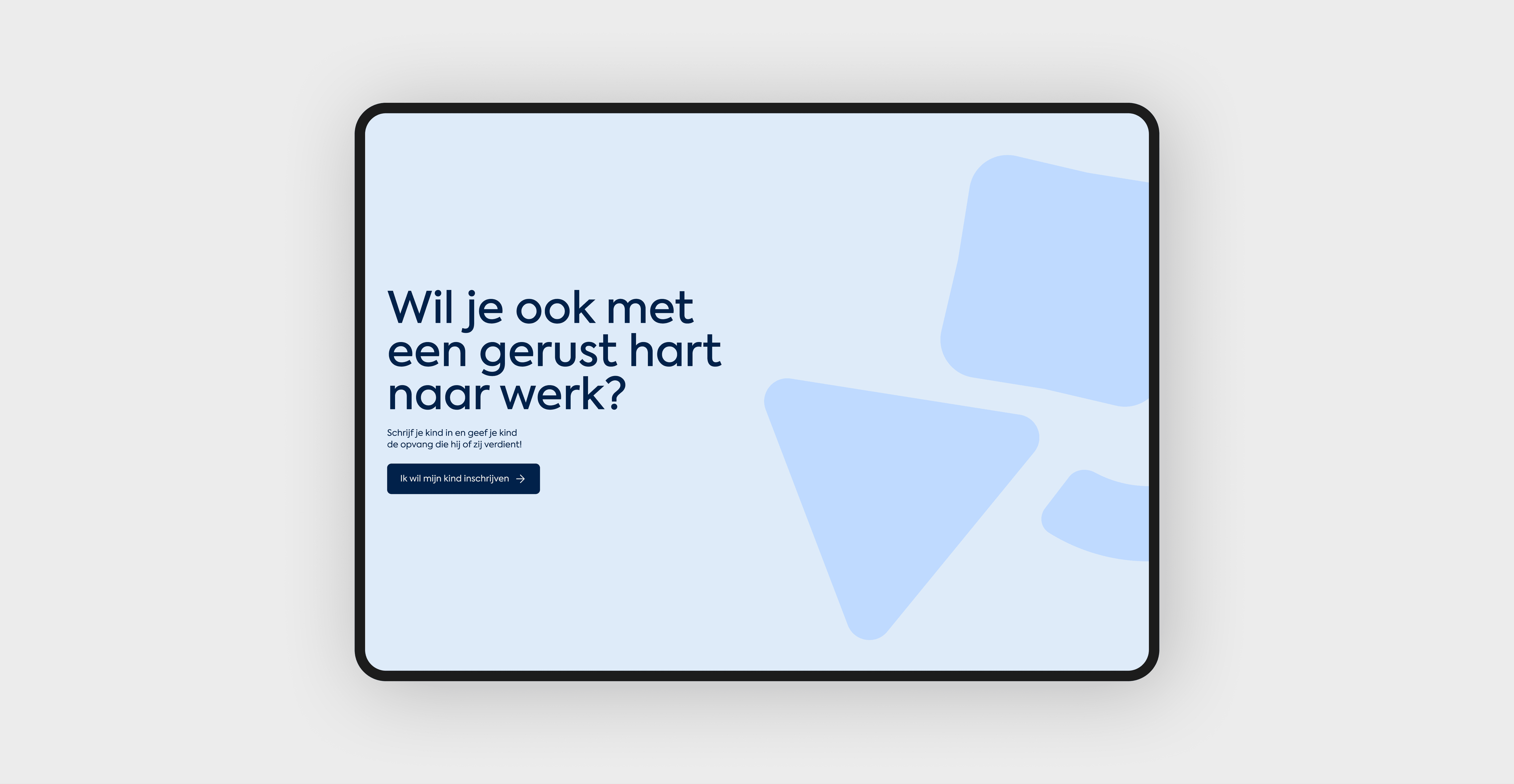
The basic shapes represent the strong foundation Welkom Kind offers in a playful and learning way during childcare, encouraging growth and development while fostering creativity and exploration in a nurturing environment.

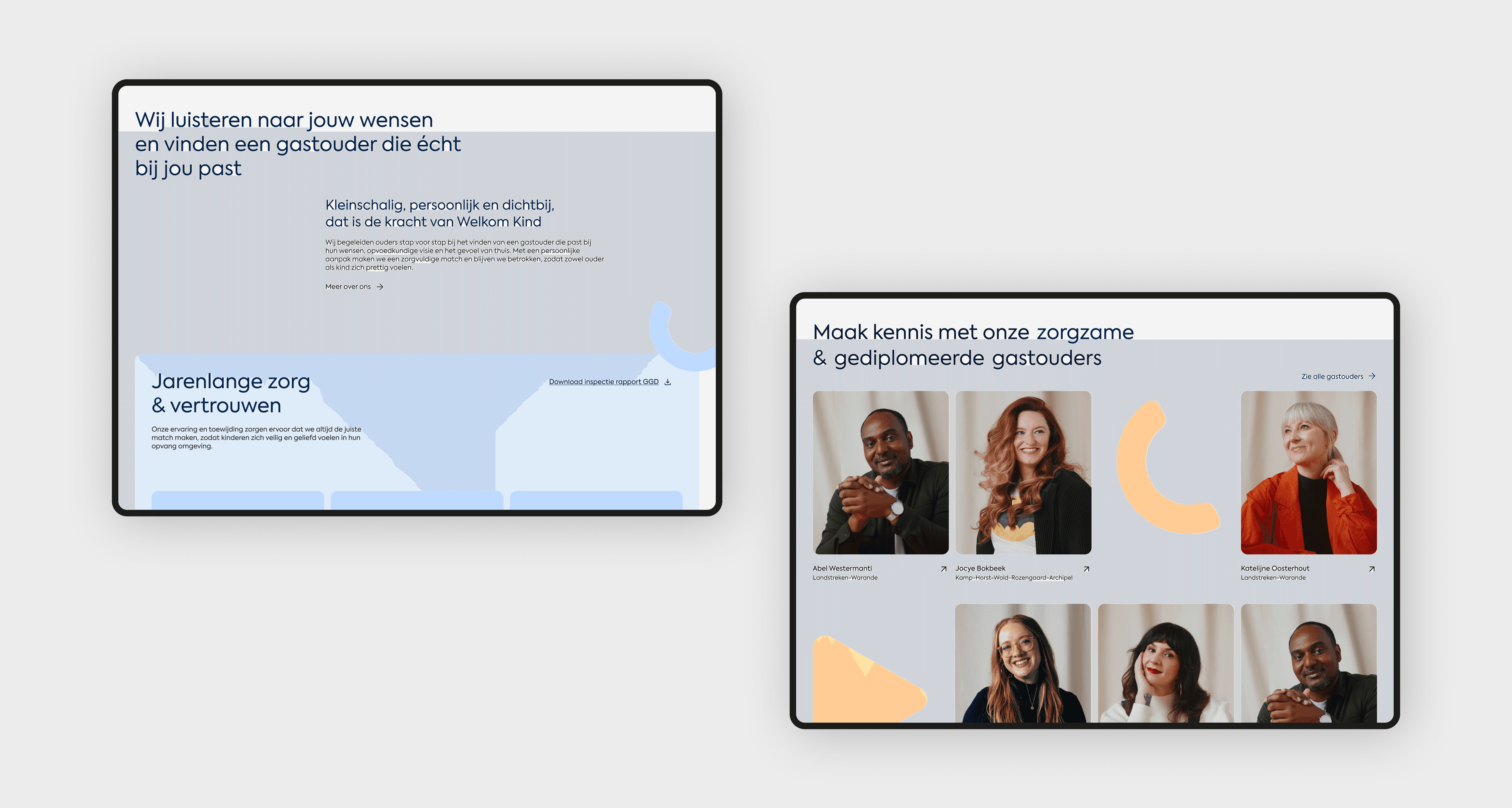
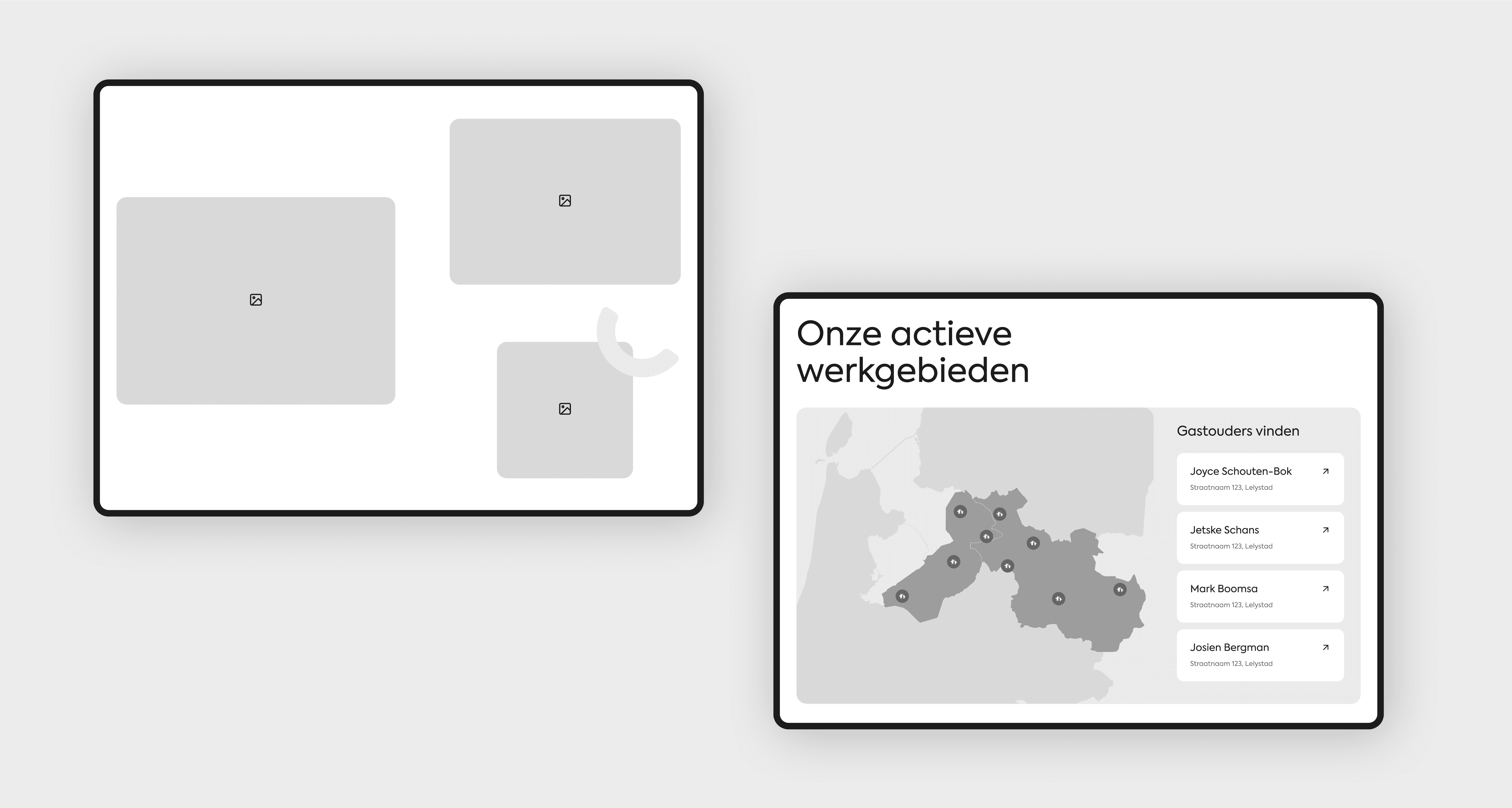
Streamlining and informing
two target audiences

The most important part of the website redesign was streamlining and informing the two target audiences: the parents and the childminders. I separated these two groups to provide each with a clear overview and the right information tailored to their specific needs.
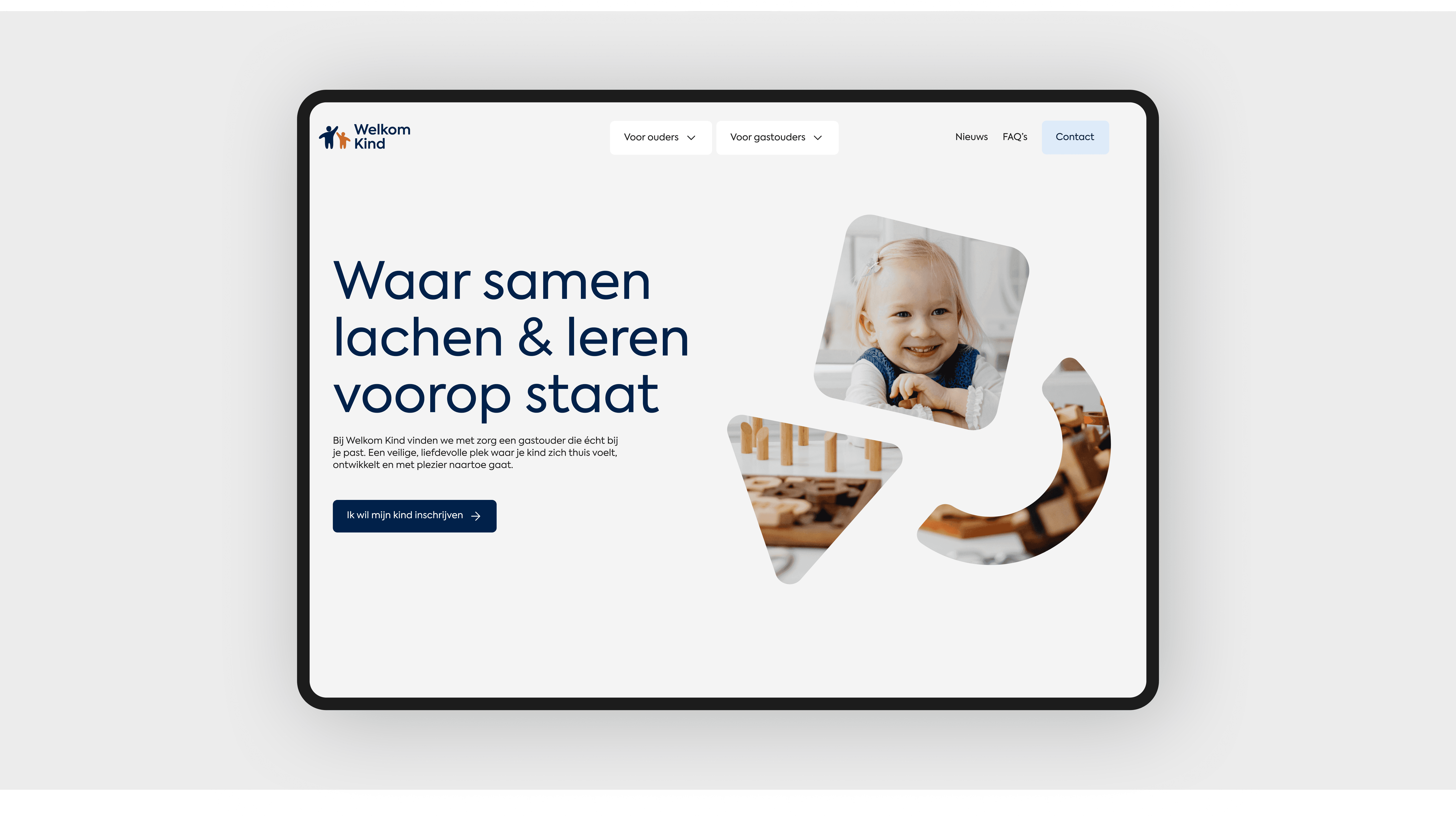
Designing the
brands voice in visual

Once the flow and wireframes were in place, I brought the design to life by transforming it into a visual experience that embodied the brands identity, using carefully chosen elements, color schemes, and photography

Credits

Branding

Kaylin Noëlla Bartelings

UX / UI Design

Kaylin Noëlla Bartelings

Development

Jake Posthouwer

Credits

Branding

Kaylin Noëlla Bartelings

UX / UI Design

Kaylin Noëlla Bartelings

Development

Jake Posthouwer

Credits

Branding

Kaylin Noëlla Bartelings

UX / UI Design

Kaylin Noëlla Bartelings

Development

Jake Posthouwer