Pedaluxe

A (digital) conceptual solution for The Federal Government of Germany, to promote cycling as an attractive and practical means of transportation among working individuals.

Client

The Federal Government of Germany

Expertises

Design research / UX / UI design

Duration

10 weeks

Collab

Jake Posthouwer

Revolutionizing the
way people commute

Pedaluxe isnt just a cycling initiative, its a bold concept redefining urban commuting and personal transportation. Embracing the shift toward sustainable mobility, Pedaluxe integrates stylish, electric lease bikes into daily life, offering a practical solution for both business and personal use.

Problem

Germany aims to double the number of cyclists by 2030 to boost public health, improve urban mobility, and cut environmental impact. As a major city, Düsseldorf plays a key role in this plan.

While the city already has cycling infrastructure and promotional efforts in place, theres still plenty of untapped potential to make biking a more popular and mainstream choice for daily travel.

Solution

Based on both desk research and field research conducted in Düsseldorf, my findings shows a significant opportunity to promote cycling as a practical and appealing alternative for professionals who currently rely on leased cars. 

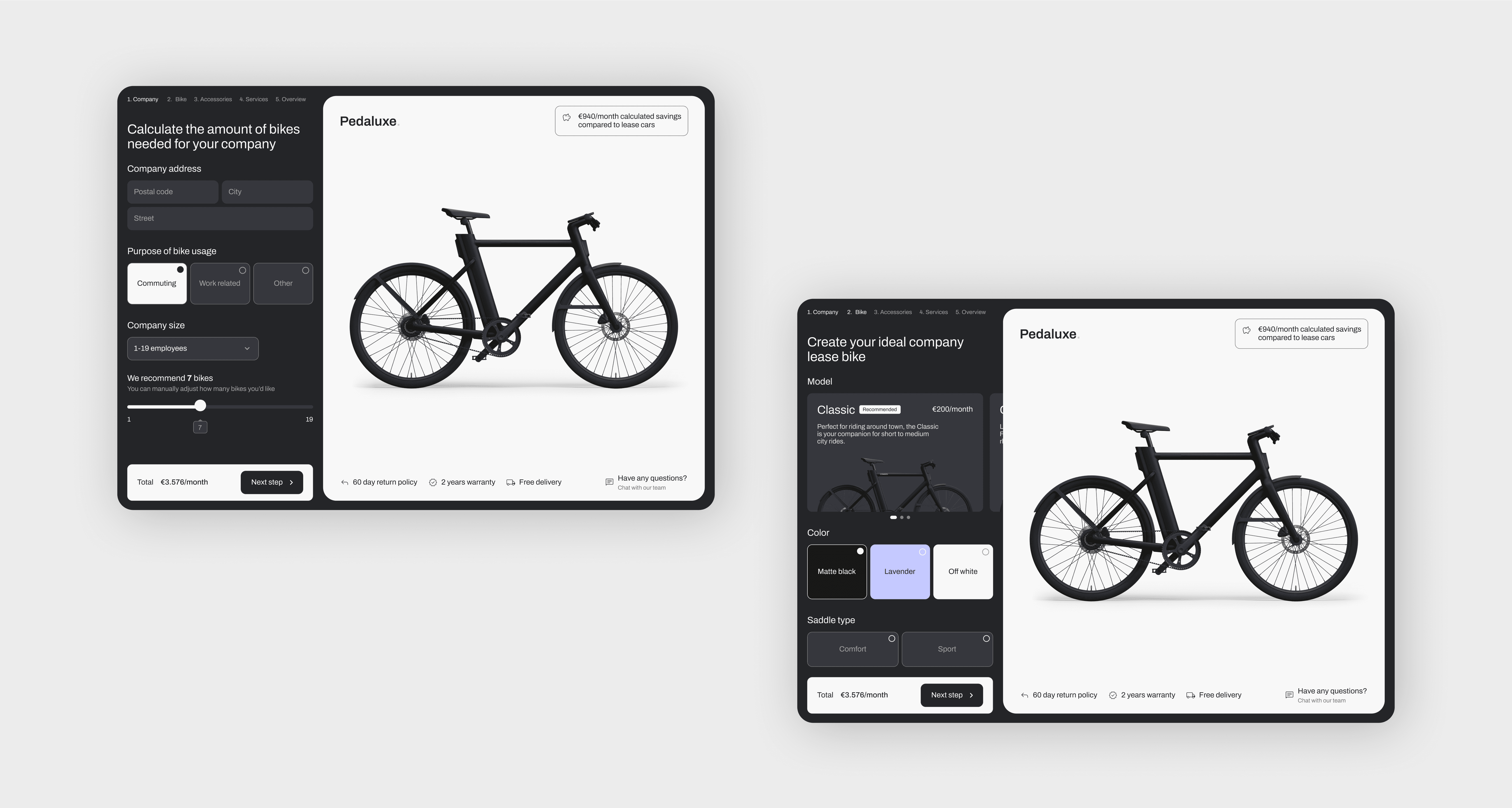
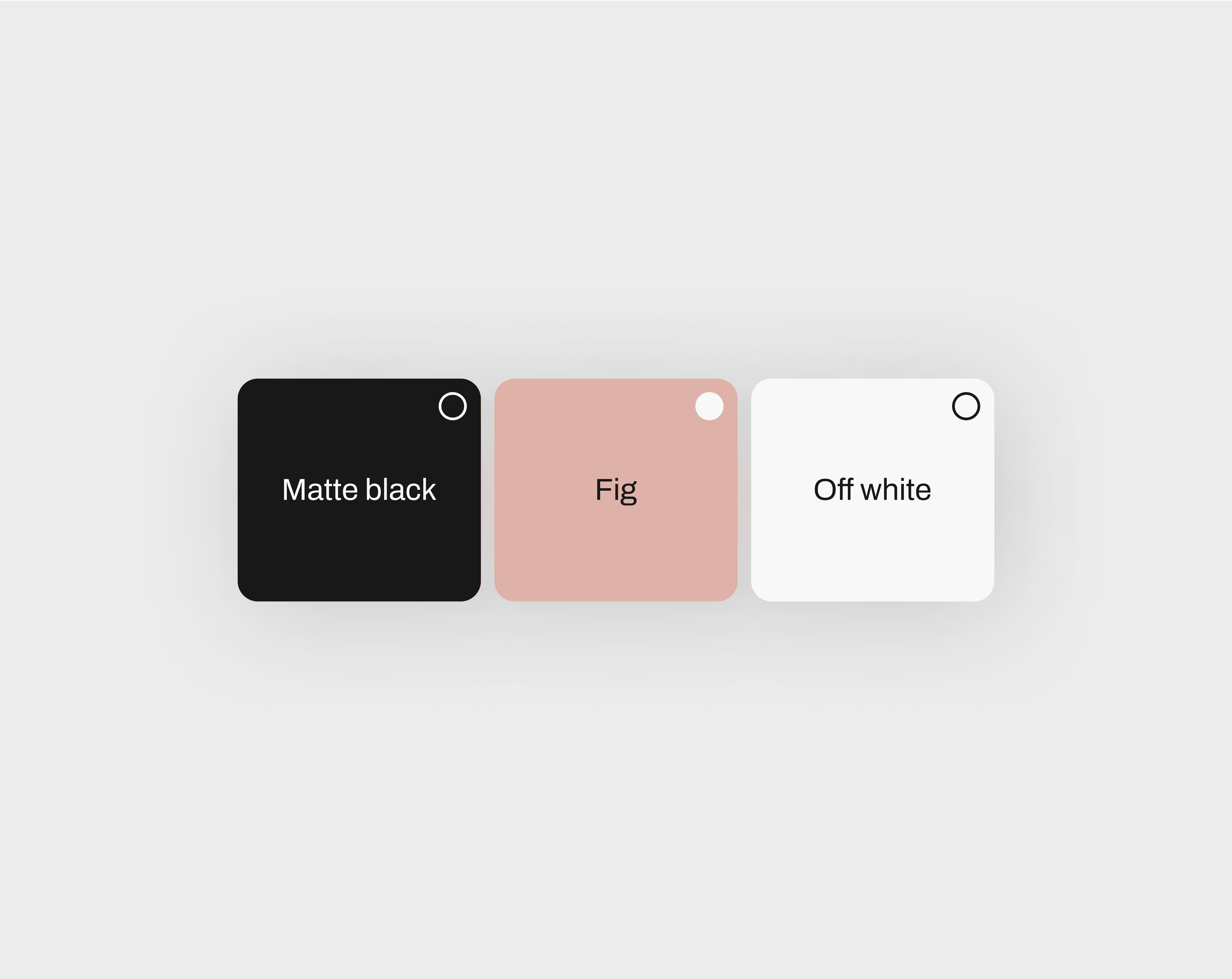
The proposal suggests companies offer electric lease bikes, like VanMoof or Cowboy, through an app-based questionnaire that personalizes the selection process.

The process began by thoroughly
researching and understanding the
clients core needs

The process began by thoroughly researching and
understanding the clients core needs

It quickly became clear that in order to create a truly impactful solution, further research was needed to identify where the greatest potential lay for promoting cycling. I needed to pinpoint the target group to whom cycling could have the most impact.

To identify the target group, I analyzed demographic data, which revealed that the majority of the population in Düsseldorf consists of individuals aged 30-49, with the majority being actively engaged in the labor market. This insight helped me focus on this group as the primary audience for promoting cycling as a practical commuting option.

To gain deeper insights, I conducted interviews with employees in Düsseldorf, which revealed that aesthetics and status played a significant role in their preference for driving over cycling. Based on these findings, it became clear that the same desires needed to be reflected in the promotion of cycling.

To achieve this, I combined a slim, elegant typography for a clean, refined look, and a dark color palette to give it a modern feel. Meanwhile, purple accents add a touch of luxury and help the design stand out.

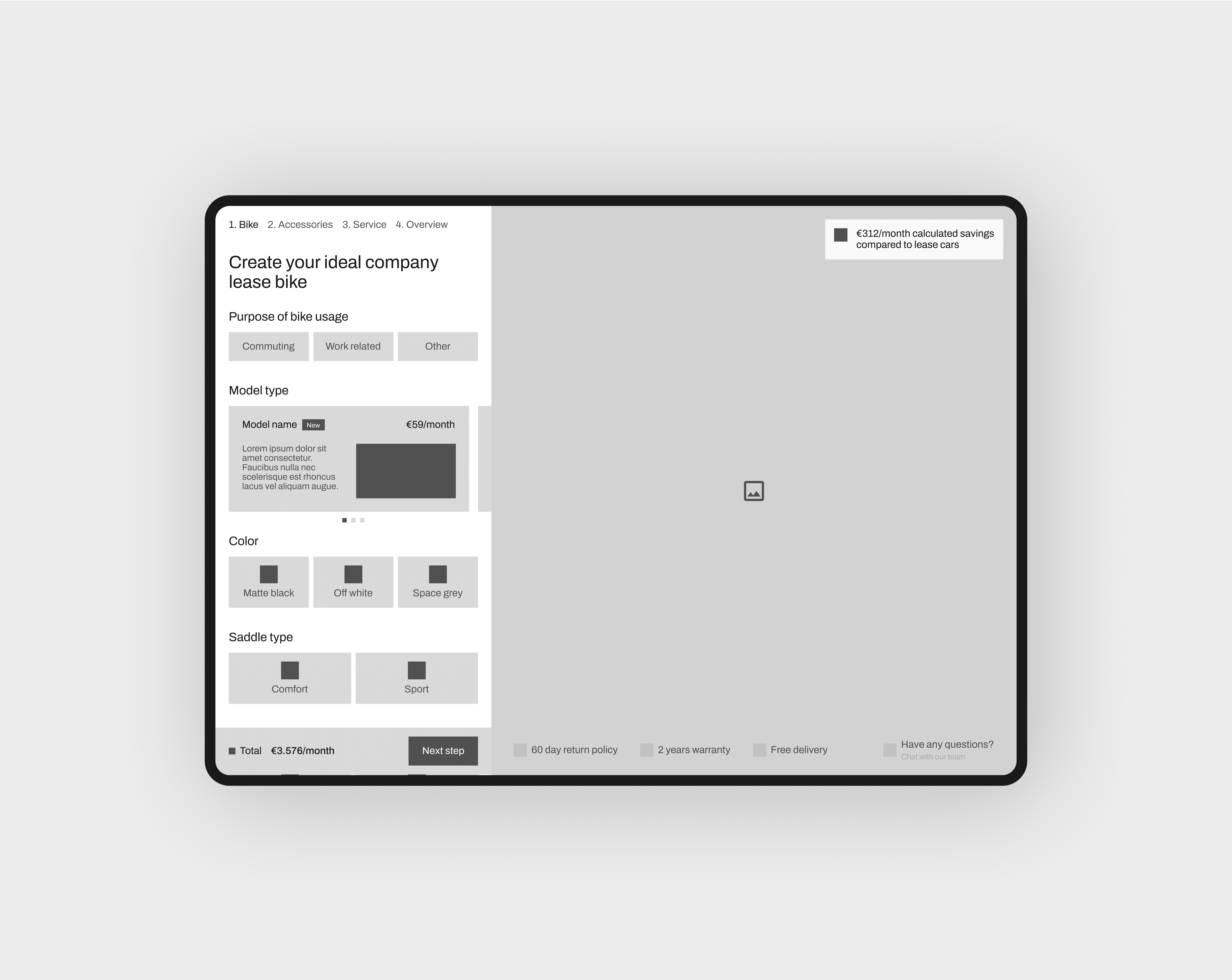
Simplifying bike leasing
and usage tracking

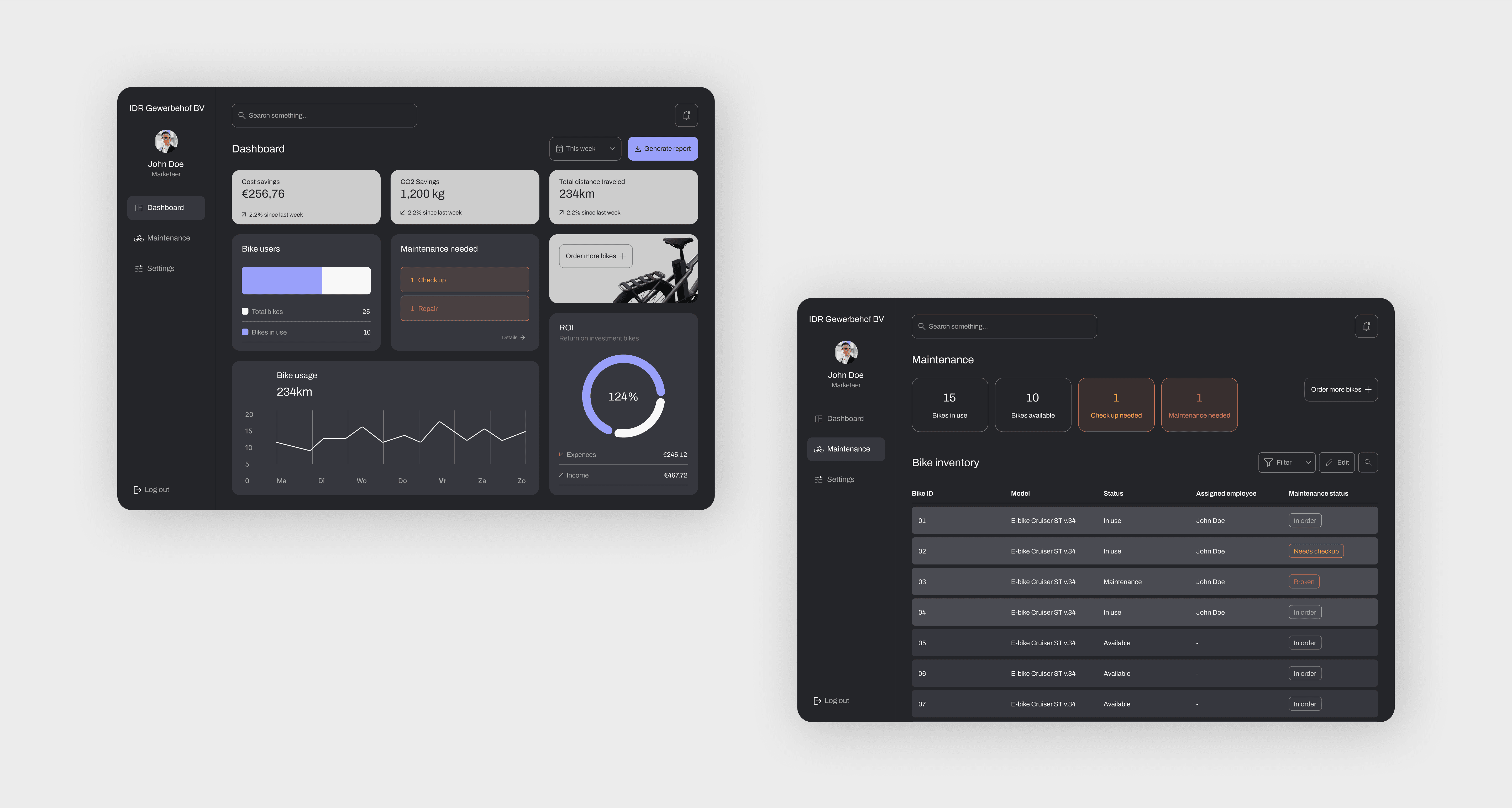
I created two applications. One app is for employers, featuing a simple, interactive ordering process with clear steps, allowing them to customize their selection and feel involved. The app also includes a dashboard with insights into employees' bike usage, helping employers understand the impact of the lease bikes.

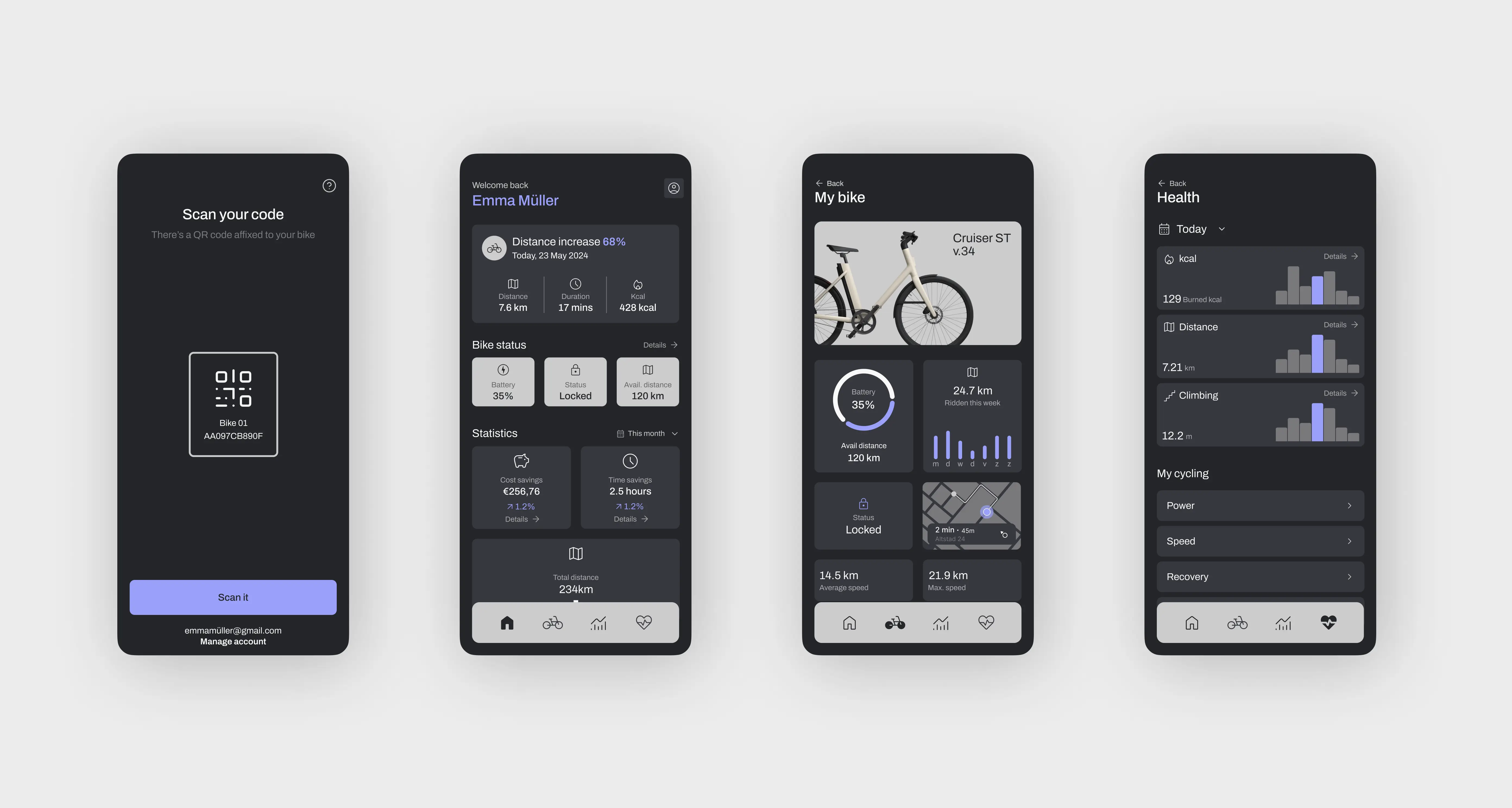
The second app is for employees, where they can lease their bike and track stats, such as how much they've cycled, details about their bike, and how much money they've saved compared to driving. The app complements the physical product and is designed to be user friendly, focusing on simplicity and ease of use, making it easy for users to find and access the information they need.

Transforming luxury into modern
simplicity in every detail through
digital design

Transforming luxury into modern simplicity in every
detail through digital design

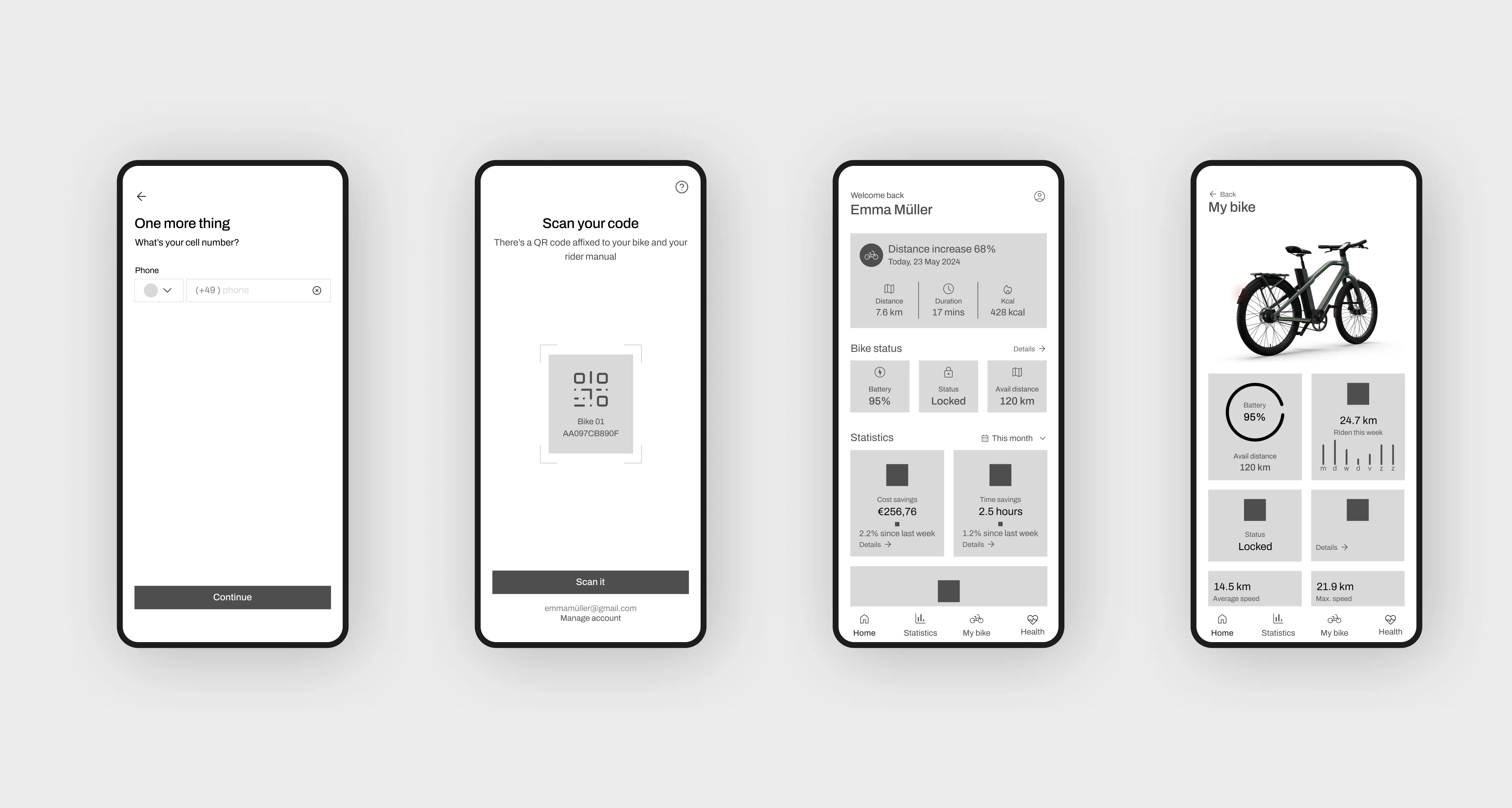
Finally, I turned the look and feel into wireframes, ensuring the design was both luxurious and simple. I focused on making data visualization clear and easy to understand, so users could quickly access and interpret important information.

Credits

Research

Jake Posthouwer

Kaylin Noëlla Bartelings

UX / UI Design

Jake Posthouwer

Kaylin Noëlla Bartelings

Motion

Jake Posthouwer

Credits

Research

Jake Posthouwer

Kaylin Noëlla Bartelings

UX / UI Design

Jake Posthouwer

Kaylin Noëlla Bartelings

Motion

Jake Posthouwer

Credits

Research

Jake Posthouwer

Kaylin Noëlla Bartelings

UX / UI Design

Jake Posthouwer

Kaylin Noëlla Bartelings

Motion

Jake Posthouwer