A community building
CrossFit box
Whether you're new or experienced, CrossFit U1 is here to guide you with personalized support. They focus on mastering techniques, building strength, and improving endurance, creating a solid foundation for lifelong fitness. At CrossFit U1, they take a full approach, combining physical strength with mental toughness and feeling good emotionally. Their close community gives you encouragement, support, and a place to belong.
Problem
CrossFit U1 approached me with a clear goal: to create an energetic new branding and a fresh website. They wanted a site that was not only easier to navigate but also showcased the heart of their gym, their strong and supportive community.
The challenge was to capture their energy and sense of togetherness while making the digital experience simple and engaging for users.
Solution
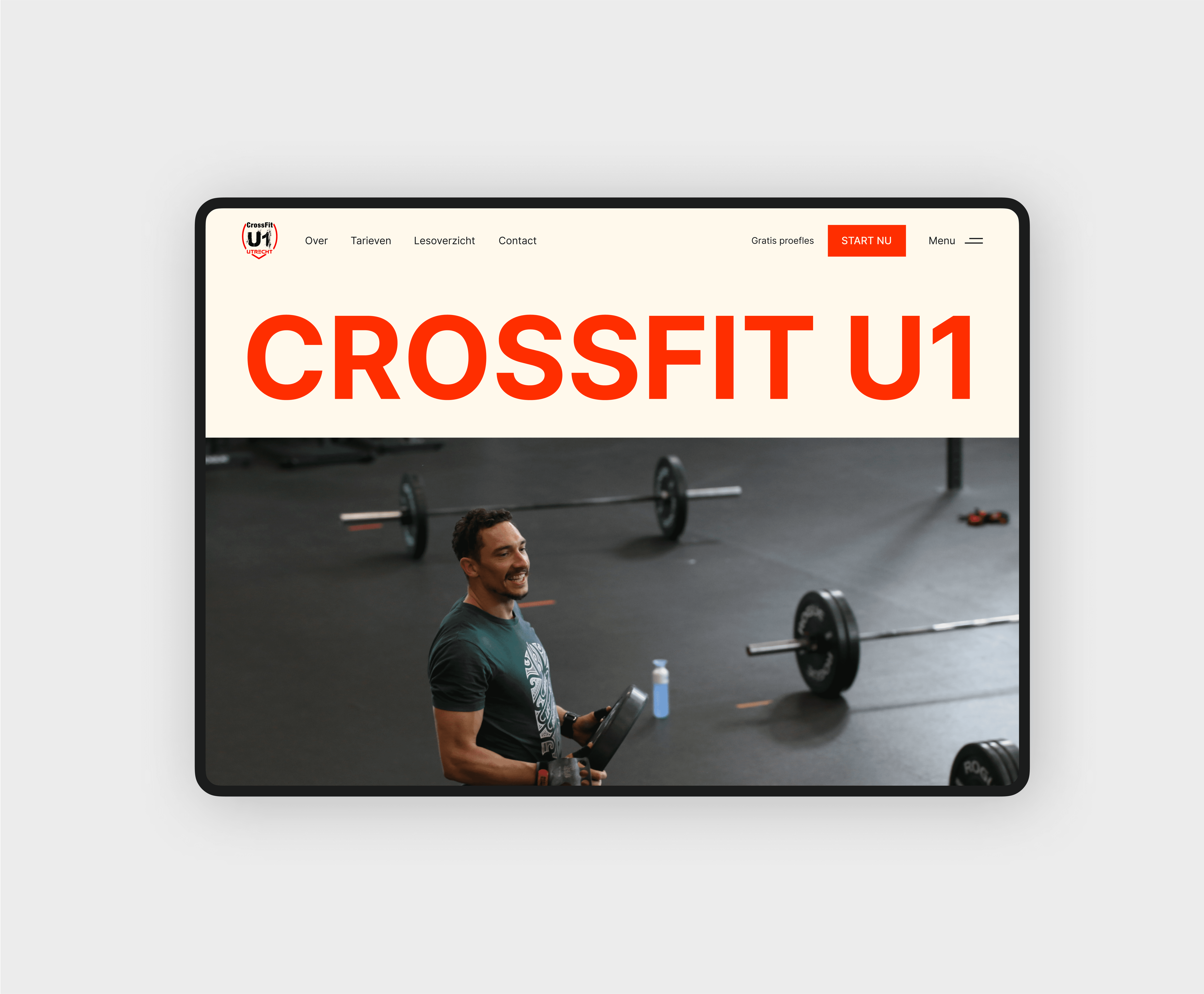
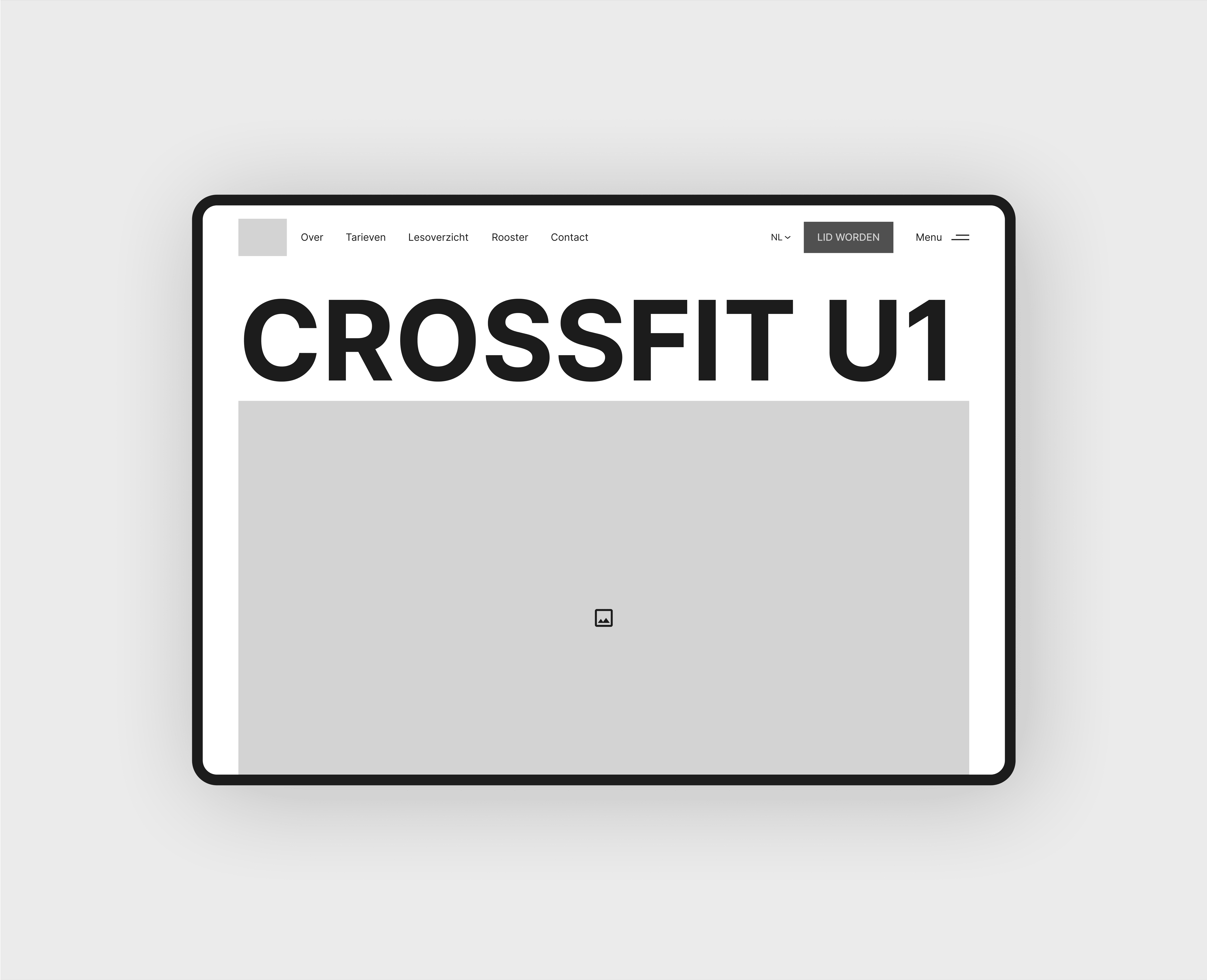
I designed a bold, brutalist-inspired website for CrossFit U1, staying true to their existing color palette to maintain familiarity. However, I enhanced the colors to be more vibrant, giving the brand a fresh and energetic look. This bold style was carried into the new website, where photography played a central role. By showcasing high-energy images of their members, the website became a genuine reflection of CrossFit U1’s community spirit.
The result? A brand and website that are dynamic, authentic, and bold, just like CrossFit U1.

Before starting the design, I visited CrossFit U1 to learn more about their community and goals. Spending time at their gym helped me see their energy, how members connect, and the overall vibe. I also talked with the owners, staff and members to understand what they value and what makes CrossFit U1 special.
This gave me a clear idea of their strong community spirit, focus on growth, and their goal to make fitness fun and welcoming. These ideas shaped the branding and website, making sure the design truly reflected who they are.


Building a strong and energetic
community through photography
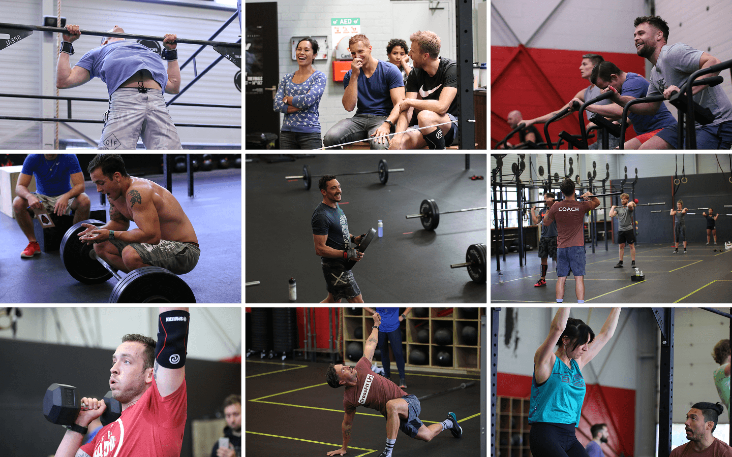
To reflect the strong sense of community at CrossFit U1, I carefully selected photography that shows members interacting, training together, or sharing moments of laughter. These images reflect the essence of teamwork and support.
By focusing on real moments of people engaging with each other, the photography shows the idea that CFU1 is more than just a gym, it's a community where everyone belongs.
Thinking out the flow and
structuring content through
wireframes
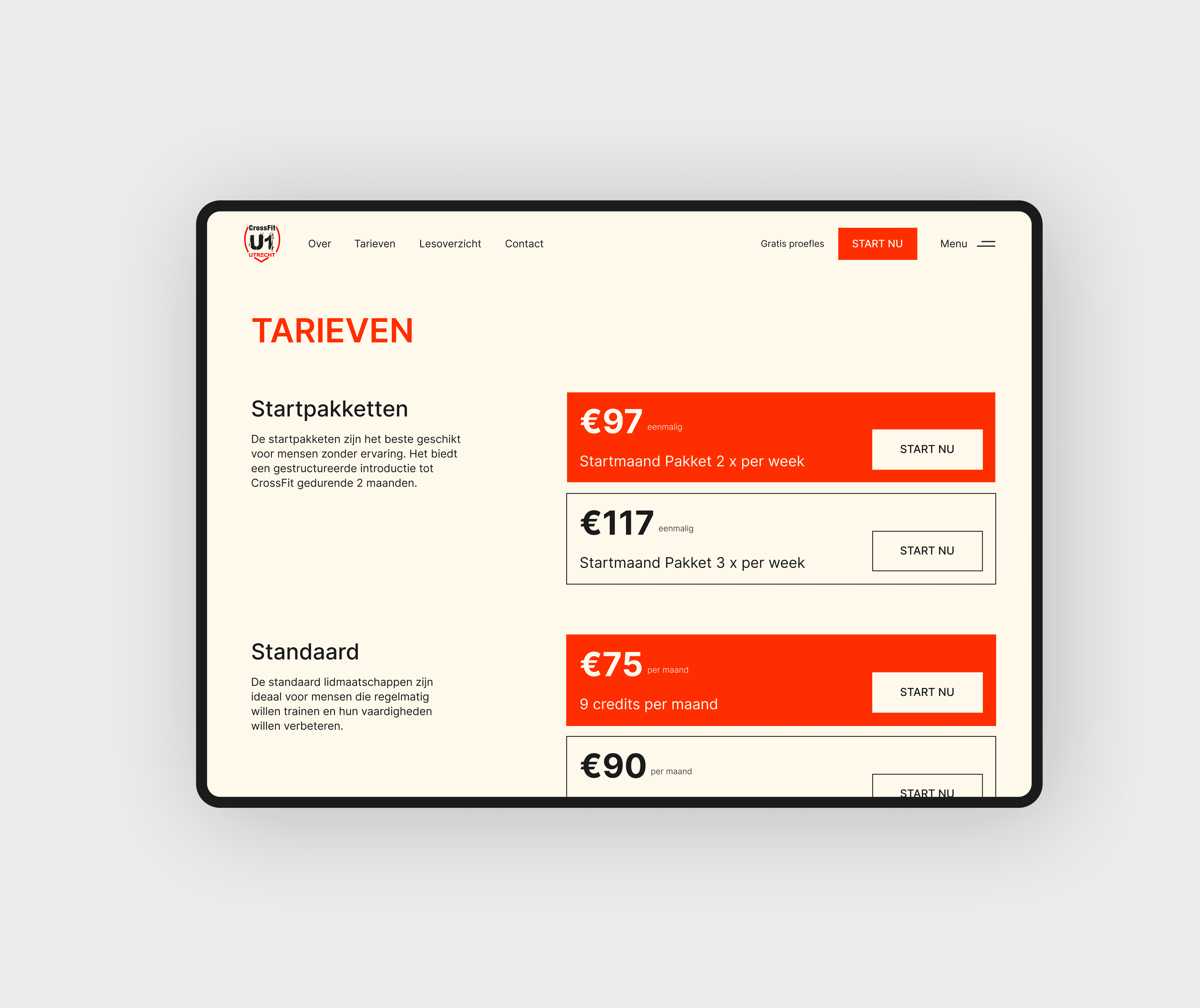
To create clarity and structure, I designed wireframes that mapped out the flow and content of the website. My goal was to make the class offerings and subscription options easy to understand.
I sat down with the client to review and group all the available memberships, organizing them in a way that allows potential customers to easily compare options, understand the value of each membership, and choose the one that best fits their lifestyle, needs, and goals.


Bold energy, sense of
community & clean design
Finally, I translated the look and feel of the branding and photography into the wireframes, transforming them into a vibrant and dynamic design. My focus was on capturing the boldness of the branding and the energetic spirit of CrossFit while ensuring the design remained balanced.
To do this, I used plenty of white space so that each part of the design could stand out without feeling too busy. This helped keep the bold style clear and easy to follow.